
 Property Finder · Astra
A design system that started with a “no.”
Over 100 shades of grey. More than 20 button variants. And teams building the same things, again. I made the case for a design system at Property Finder. Leadership had other priorities. So I found two engineers, and we started small.
- My role
- Principal Product Designer
- Scope
- Design system · Design & engineering
I initiated and championed Astra: auditing the UI, pitching the business case, rallying our first engineering partners and shaping the system from foundations to components and guidance. As it grew, I pushed its expansion into native libraries, illustrations and design tokens.
- 85%
- UI covered by Astra
- +22%
- Average sprint velocity
- −62%
- Time spent on UI code changes
We had 100 greys. We didn’t need 101.
The audit made the problem pretty hard to ignore: more than 100 shades of grey and over 20 button variants were already in production. Each one was a small decision somebody had made. Together, they were a lot of decisions we kept paying for.
With very few shared components, designers drew familiar things again. Engineers built familiar things again. Then everyone maintained the slightly different results. As the company grew, every new team had more variations to navigate.
I wanted to turn those repeated decisions into reusable building blocks, so teams could spend their time on the actual product. First, I tried the sensible route.
The deck got a “no.” The problem stayed.
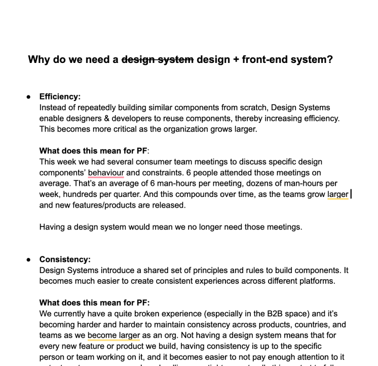
I put together a business case and presented it to product and engineering leadership. The argument was about time and delivery: less rebuilding, fewer UI debates, more consistency across the product. A design system was also a front-end system, and the benefit needed to make sense to both sides.
It didn’t secure the priority or resources. Fair enough—there were other things competing for attention. But we still had the same buttons to rebuild on Monday.
So I changed the approach. I partnered with two front-end engineers and we started a small, guerrilla effort. My kickoff message was fairly accurate: “currently we are basically 3 people 😂”. A startup within the startup.
I brought the audit, the design direction and the case for a shared system. They brought the engineering partnership to make it real. Instead of waiting for a fully staffed initiative, we had a team small enough to get moving.
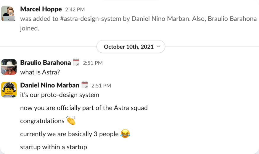
We gave ourselves three principles to keep that effort useful: flexibility over comprehensiveness, so teams still had room to solve new problems; “no code, no party”, because customers use the implemented product; and guidance, because a component collection without it is just a UI kit.
Start with the bricks. The spaceship comes later.
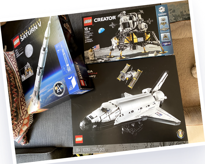
I’ve been a Lego fan since I was a kid. That probably explains a lot. A few well-defined pieces, with predictable ways to connect, can become something far more interesting than the pieces themselves.
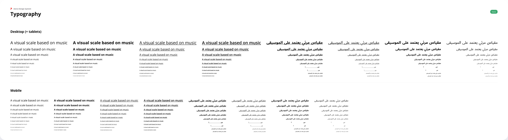
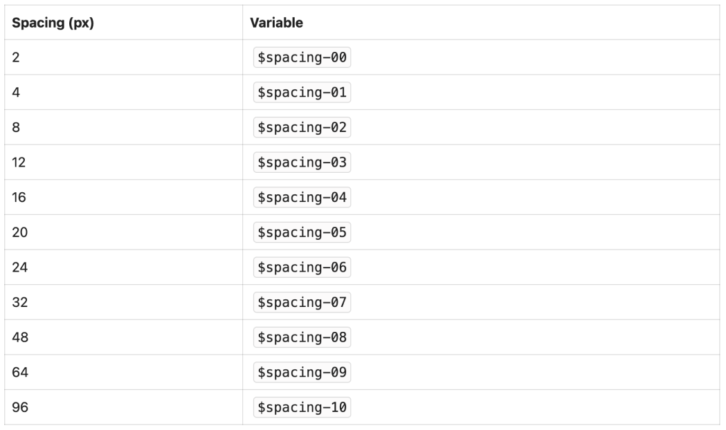
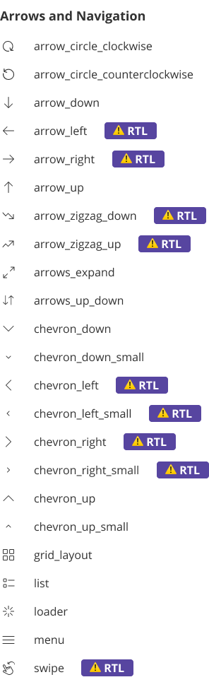
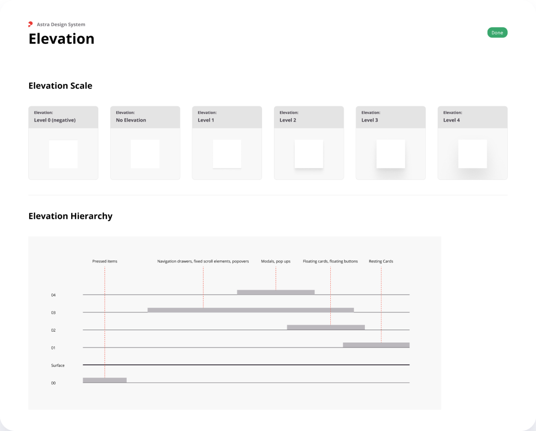
I took the same approach to Astra. Before building a catalogue of components, I worked through the foundations: colour, typography, iconography, spacing and elevation. These were the decisions every future component would inherit. Getting them coherent first meant we could compose more complex interfaces without reopening the basics each time.
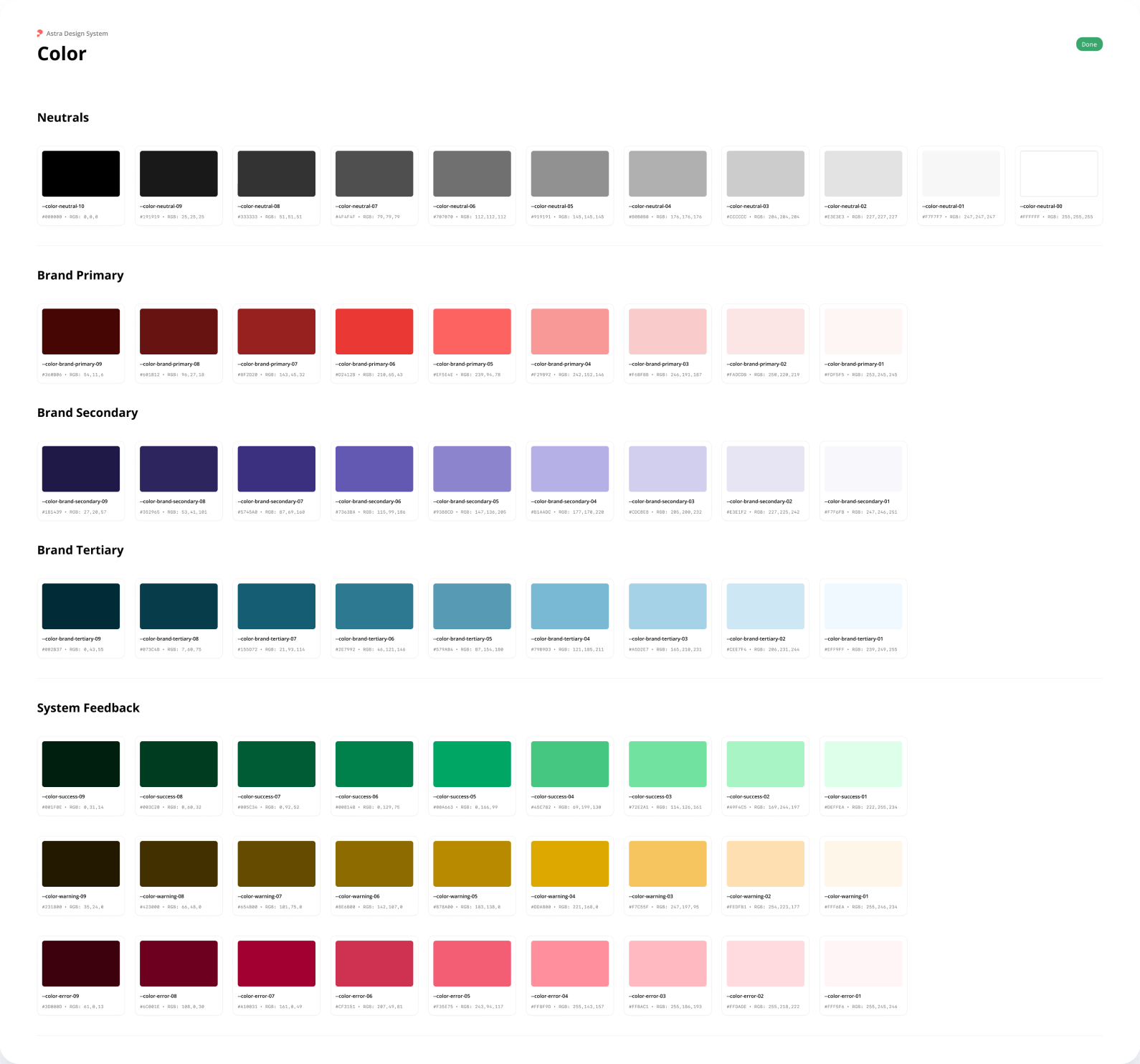
That meant defining colour roles and scales, typography for English and Arabic across screen sizes, a shared spacing scale, and levels of elevation. Iconography needed rules too: a directional arrow can’t blindly behave the same way in a right-to-left interface.
This is where systems thinking becomes very concrete. The spacing around a button, its text, its icon and its relationship to the surrounding surface all need to agree.
Then make the bricks do useful work.
With that foundation in place, we could build components in manageable stages. The roadmap started with everyday controls—buttons, checkboxes, radio buttons and text fields—then moved into larger pieces such as property cards, banners, modals and bottom sheets.
I helped shape that progression with engineering. We needed a shared set of parts people could use, without trying to design every possible interface up front. The roadmap gave us a sequence to work through together.
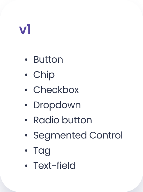
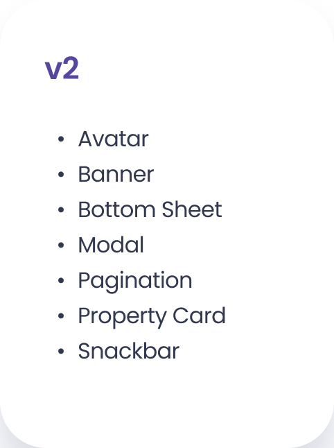
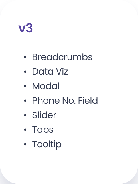
And “done” couldn’t mean a nice default state in Figma. Buttons needed hover, pressed, focused and disabled states. Inputs needed to handle things going wrong. Variants had to make sense as component options in code.
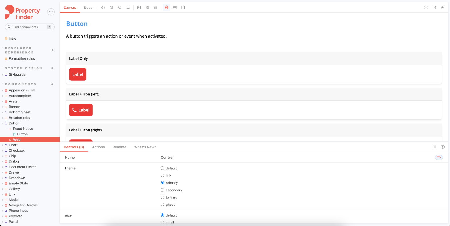
We used Storybook to make the implemented components visible and explorable. Designers and engineers could look at the same working button, change its options and discuss what it actually did. That was the point of “no code, no party”: the system had to survive contact with the product.
Give people more than a library link.
Once other teams started using the parts, the next problem was coordination. Where do I find the right component? When should I use it? Where does a missing variant go? A Figma link can only answer so much.
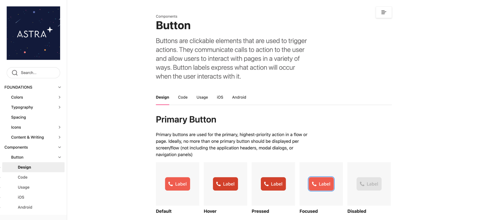
I helped build the documentation and working practices around Astra so people could understand it, contribute to it and keep it moving in a coherent direction. The button page, for example, brought design, code and usage guidance together, with platform-specific sections. It explained the choice as well as the appearance.
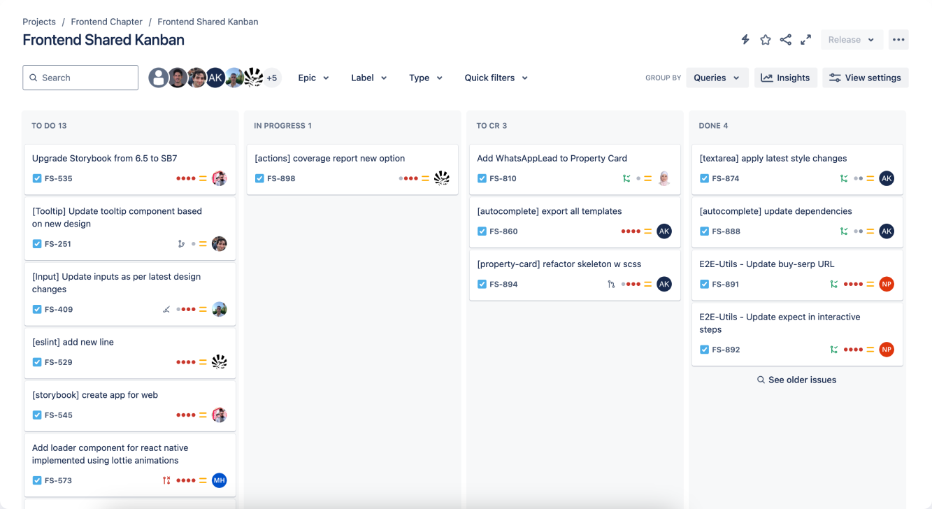
We organised delivery in a shared Jira project, where designers and engineers could follow work from the backlog through implementation and code review. A dedicated company Slack channel gave us somewhere to announce changes, gather feedback and work through questions.
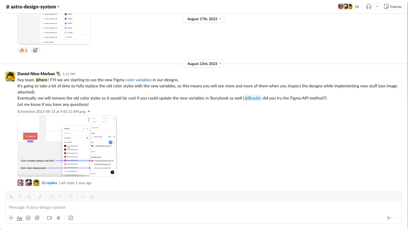
I used that channel to keep people involved as the system evolved. The token rollout below is a good example: I explained the change, the gradual migration away from old styles, and what needed to carry through into Storybook. Keeping design and engineering aligned was ongoing work, not a handoff at the end.
Three people became a system teams could build on.
Astra grew from that small start into a shared foundation used across Property Finder’s products. The reported results showed why it was worth getting off the ground:
85%
UI covered by Astra
Shared styles and components were widely used across products.
+22%
Average sprint velocity
Teams had reusable building blocks to bring into product work.
−62%
Time spent on UI code changes
Less effort going into fixing and refactoring the interface.
A working system was the starting line.
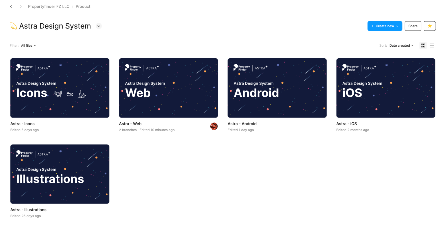
I kept pushing Astra’s evolution: dedicated components for iOS and Android, alongside web, and a consistent illustration library. Shared foundations gave us a common language; platform-specific libraries gave us room to respect how each product should behave.
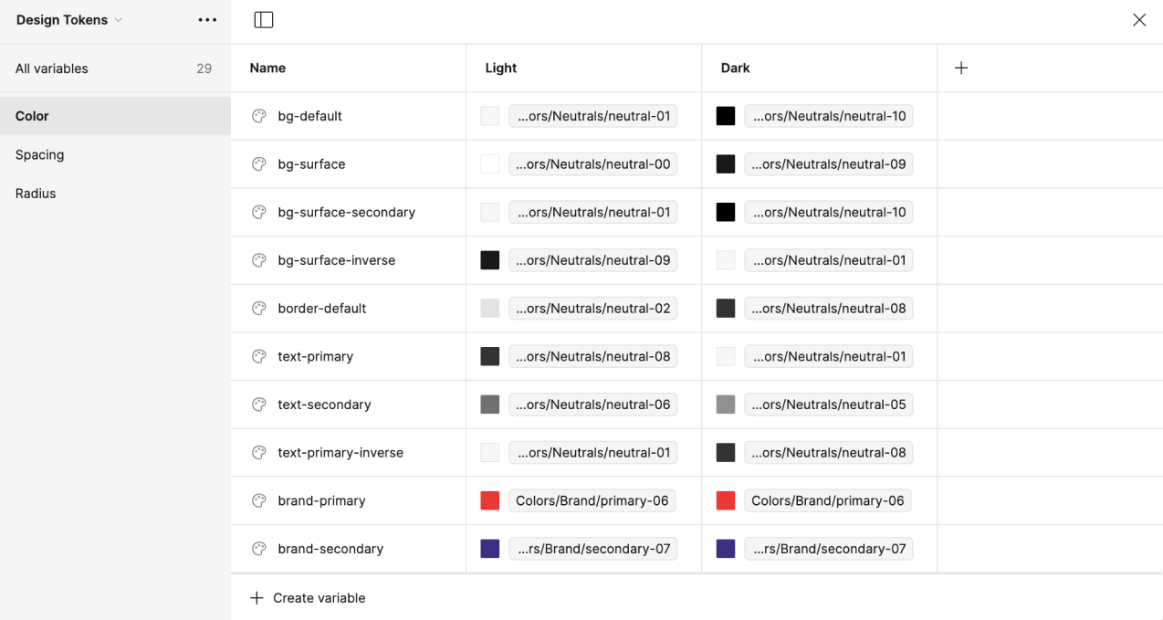
I also introduced design tokens for the first time. Instead of choosing a raw colour each time, a component could refer to a role such as text-primary or bg-surface. The token example below maps those roles to underlying colours across light and dark values. That made the intent of a decision explicit, and gave design and engineering a clearer vocabulary to share.
The part I’m proudest of is getting people moving around a problem that hadn’t made the priority list. I made the case, found partners when the first route stalled, and helped turn a few useful pieces into a system others could use and extend. Still a Lego project, really. Just with more pull requests.
The reported improvements may reflect a combination of this work and other factors, rather than this work alone.